
How to Read AI Conversations With Dyslexia-Friendly Typography
Long ChatGPT, Claude, and Gemini answers punish dyslexic readers. Here is a typographic setup that makes AI conversations comfortable to read at length.
Long AI answers are hard enough to read when the font cooperates. When it does not, dyslexic readers get punished twice: once by the length of the answer, and again by every letter that flips, crowds, or blurs. ChatGPT, Claude, and Gemini all render their web output in tight system stacks that were never tuned for reading comfort. The result is a wall of grey text that fights the eye before the eye reaches the first idea.
This guide is for anyone who processes text differently and still wants to read long-form AI output as documents rather than as scrolling chat. It works whether you have a formal dyslexia diagnosis, whether you read slower in low light, or whether you want typography that respects your attention. The fix is not a special app or a plugin. It is a small set of typographic choices you can apply to any AI conversation once you get it out of the chat window.
Why chat interfaces punish dyslexic readers
Chat UIs optimize for turn-taking, not for reading. Line length runs edge to edge on desktop, which pushes each line past the roughly sixty character sweet spot the British Dyslexia Association recommends in its style guide. Line height is usually 1.4 or lower, which crowds ascenders into the descenders of the line above. Font weight is often 400 in a humanist sans that was picked for UI density, not for readability at length. None of these choices are wrong for a chat panel. They are wrong for a document.
Then the answer keeps growing. A Claude reply about a legal doctrine can hit three thousand words. A ChatGPT deep research answer can hit ten thousand. Reading that much text in a chat panel is uncomfortable for anyone, and for a dyslexic reader it drifts closer to work than to reading. The problem is not the model. The problem is the container.
What the research says helps
The evidence on dyslexia-friendly fonts is more modest than the marketing suggests. A 2020 review in Frontiers in Psychology found that specialty fonts like OpenDyslexic and Dyslexie did not consistently outperform well-chosen mainstream fonts once other variables were controlled. What did help across almost every study was the rest of the typographic stack: generous line height, shorter line length, warmer background color, and larger size. The font itself matters less than most people assume.
That is good news, because you do not have to install anything exotic. You can read AI conversations comfortably in fonts you already have, once you fix the environment around them. A short checklist covers most of it and works across desktop, tablet, and phone. Adjust each value to taste, then leave it alone for a week before tuning further.
- Size at 18 to 22 pixels, not the 14 to 16 chat panels use.
- Line height around 1.6 to 1.8.
- Line length capped at 60 to 70 characters.
- Background at a warm off-white or a soft charcoal, never pure white or pure black.
- Body font in a humanist sans like Atkinson Hyperlegible, Lexend, or Inter at 400 weight.
If a single font gets picked, Atkinson Hyperlegible from the Braille Institute is a defensible default. It was designed to disambiguate the letter pairs that dyslexic readers most often confuse, and it reads well at long length without looking clinical. Lexend is a strong second choice if you find Atkinson too plain. Both ship as open fonts, so any reader that respects a custom font stack will render them without a paid license.
A workflow that survives the whole answer
Fixing typography inside the chat window only helps until the next answer streams in. A workflow that lasts has three steps: export the answer out of the chat, read it in a tool tuned for long-form markdown, then keep it somewhere you can come back to. Each step is boring on its own. Chained together, they turn AI output from disposable chat into a personal library you re-read on purpose.
Export looks different for every provider. ChatGPT and Claude both let you copy a full turn as markdown, and both keep code blocks and lists intact. Gemini needs a little more care because its share links strip formatting on some browsers. For a fuller walk through, the guide on how to read ChatGPT conversations as beautiful documents covers the export step for the biggest provider, and the Gemini export guide covers Google's side of the same problem.
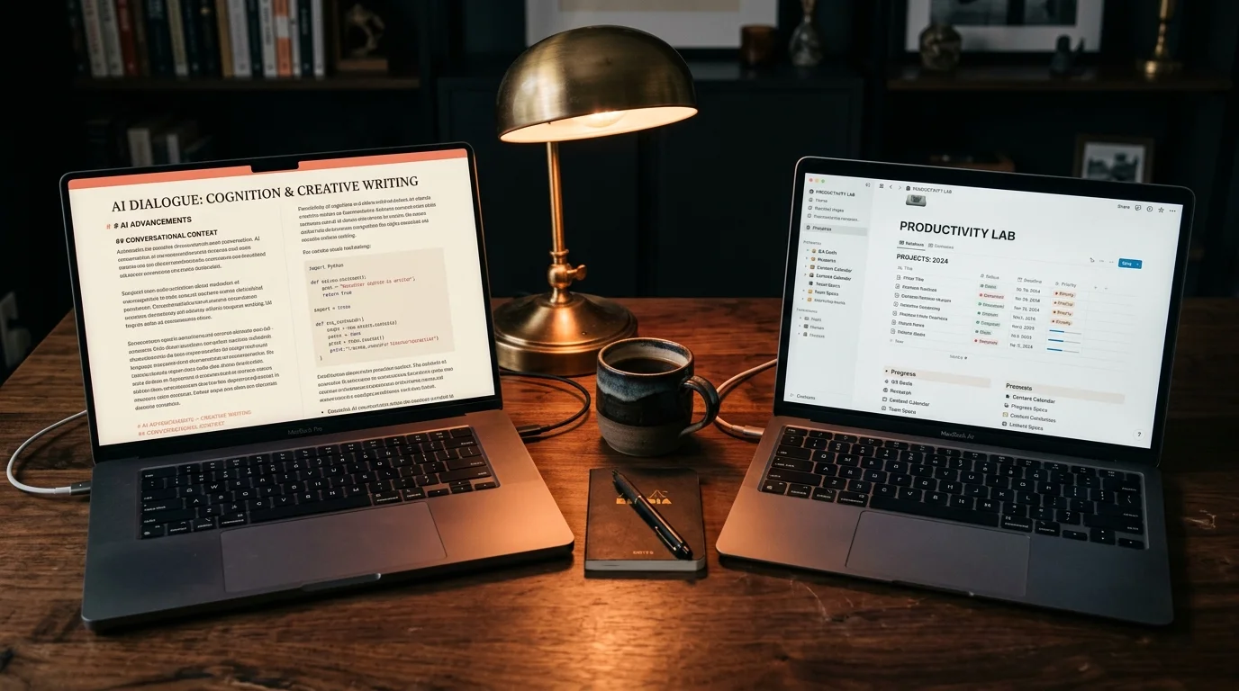
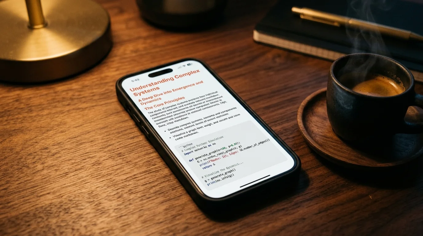
Reading is where Prism MD earns its place in the stack. It renders markdown in a controlled typographic environment with configurable size, line height, and background. It also handles the long-form problems that break most markdown viewers: KaTeX for math, Mermaid for diagrams, and syntax highlighting for code. If you want the reasoning behind those defaults, the essay on why AI-generated markdown deserves better typography walks through the choices.
Keeping the answer is the step most people skip. If you read a good Claude answer once and never save it, you will re-ask the same question in three weeks. A small folder of saved conversations, named by topic rather than by date, will pay for itself inside a month. The guide on how to save AI conversations you want to re-read has a folder structure that works for most people.
Tuning color and contrast
Pure white on pure black is the most common recommendation online and one of the worst for dyslexic readers. The high contrast produces a shimmer effect on some readers and can make letters appear to move on the page. A warm cream at roughly hex FBF5E9 with dark charcoal at roughly hex 1F1B16 gives you enough contrast to be legible without the vibration. It also matches how ink looks on cream paper, which is where most of us learned to read in the first place.
If you read at night, invert the pairing. A soft charcoal background at roughly hex 12100F with warm off-white text at roughly hex E8DFCC preserves the same warmth without the glare of a lit white page. Both pairings meet WCAG AA contrast for body text at body size. If you want to check your own colors, the WebAIM contrast checker is the standard tool and takes under a minute per pair.
FAQ
Do I need an OpenDyslexic font to read comfortably? No. Recent research suggests specialty fonts do not consistently beat well-tuned mainstream fonts. Fix size, line height, and line length first. Then pick a humanist sans you like and stay with it for at least a week before switching.
Does dark mode help or hurt dyslexic reading? It depends on the room and the time of day. In a dark room, a warm off-white on soft charcoal reduces glare and is easier on the eyes. In a bright room, a warm cream background with charcoal text tends to read faster. The rule is to match the page to the light in the room, not to the time on the clock.
Can I apply the same rules to code blocks in AI answers? Yes, with one adjustment. Bump code font size to at least 16 pixels, and pick a monospace with clearly disambiguated zero, letter O, digit one, and lowercase L. JetBrains Mono and Cascadia Code both do this well. Keep line height slightly tighter than body text so multi-line code still reads as a single block.
What about audio as a backup for the hardest sections? Reading and listening together is a real reading strategy, not a workaround. Many dyslexic readers report better retention when they follow along visually while a text-to-speech engine reads at moderate pace. The listen to AI conversations with text to speech guide covers a workflow that pairs cleanly with a Prism MD tab open on the same document. Start at 1.0x and only speed up once the voice stops feeling mechanical.
Read your AI conversations in typography that respects your eyes
Free to start — no credit card.
Related reading
Ready to read your own AI documents?
Open ChatGPT, Claude, Gemini, or any markdown file in the reader built for the way models write.
- ✓Renders code, math & Mermaid out of the box
- ✓Works offline once you've opened a doc
- ✓Free forever for personal reading