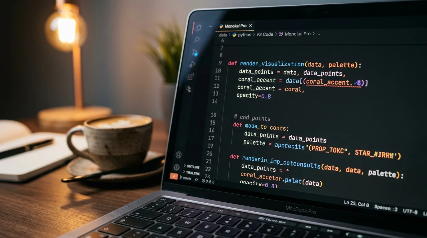
The Best Monospace Fonts for Reading AI-Generated Code Blocks (2026)
Five monospace fonts that hold up when you read long AI code blocks from Claude, ChatGPT, and Gemini, plus size and line-height picks that stick.
Most people pick a monospace font once, keep it forever, and never think about it again. That was fine when code blocks lived inside an IDE. It stops being fine the moment you spend hours reading AI-generated code inside a chat window, a markdown export, or a long transcript from an agent run. AI answers are read, not typed, and the font you use decides whether that reading is comfortable or a headache by the third page.
This guide is about the fonts that hold up when the content is dense, mixed, and often much longer than what a human would write. The picks below have been tested against real Claude, ChatGPT, and Gemini exports rendered in Prism MD on a laptop, a tablet, and an e-ink reader. Nothing here is theoretical. Every recommendation survived at least a week of daily use before earning a spot on the list.
Why AI Code Blocks Are Different
Human developers write short functions, name variables tightly, and rarely paste 400 lines of output into a single reply. AI answers do the opposite. A single Claude response can include a full component, a config file, a shell transcript, and a diff, back to back, with no visual break between them. That density punishes fonts tuned for short snippets inside an editor sidebar. Even good developer fonts start to blur when the block runs past a couple of screens.
The reading load also skews toward punctuation and structure characters. Braces, backticks, angle brackets, arrows, and pipes appear far more often per line than they do in prose. A good font for AI content keeps those glyphs distinct at small sizes and stays legible when a paragraph of markdown wraps around a code fence. If you want the wider argument for treating AI output as a real reading surface, the case sits in Why AI Markdown Deserves Better Typography. The short version is that AI text is a reading medium first and a scratchpad second.
The Shortlist That Holds Up
After a lot of side-by-side reading, five fonts keep earning their place. Each one solves a specific problem that shows up in AI transcripts, and each one is free or close to it. The list below is ordered by how quickly a new reader tends to feel at home. Read the descriptions before you pick, because the trade-offs matter more than the badge on the download page.
- JetBrains Mono: the safest default. Ligatures are optional, the italic is a real italic instead of a slant, and the zero has a dot so it never gets confused with a capital O. Prism MD ships with it, and it survives 2000-line pastes without visual fatigue.
- Berkeley Mono: the prestige pick. Warmer than most, with a slightly narrower advance width that lets more code fit per line without shrinking the point size. Not free, but the personal license is affordable and it makes long reads feel almost editorial.
- Iosevka: the density king. Narrow by design, so wide diffs and long shell transcripts stay on one line. Pick the Extended variant if the default feels too tight.
- Commit Mono: the calm one. Low contrast, even color on the page, no distracting ligatures. Good for people who skim more than they read.
- Monaspace Neon: GitHub's newer family. Handles bold and italic without the awkward width shifts that most monospace fonts suffer from, which matters when AI answers mix inline code inside prose paragraphs.
If you only try one, start with JetBrains Mono because it makes almost no demands on the reader. If it feels too geometric after a few days, move to Commit Mono for something softer. If you want a face that looks bespoke and are willing to pay a small fee, Berkeley Mono ends the search. Iosevka and Monaspace are worth trying only after you have a favorite and want to compare.
What To Look For, Not Only What To Pick
Fonts are personal, so the checklist matters more than the exact winner. When you audition a monospace face against a real AI export, watch four things closely. First, the zero and the capital O have to be clearly different. Second, the lowercase l, uppercase I, and digit 1 have to be three distinct shapes. Third, curly braces and square brackets have to read as different at your target size, not only when zoomed in. Fourth, the italic has to be a genuine cut, not a synthetic slant applied by the browser.
Line height matters as much as the letterforms themselves. AI code blocks often lack blank lines between logical sections, so a slightly generous leading, roughly 1.5, gives the eye somewhere to rest. Point size is easier to get wrong than font choice, and 14 to 15 pixels is the sweet spot for laptop reading. Sixteen works well for anything read at arm's length, and 13 is the floor for a phone in portrait. If a font looks great at 18 and mushy at 14, it is not the right pick for chat transcripts, which almost always end up in the smaller range.
Setting It Up In Your Reader
Once you have a font, the reader has to use it properly. In VS Code and most desktop editors this is a two-line settings change and takes under a minute. In browsers and chat apps it is harder, because most render code with a hardcoded system stack that falls back to the ancient Menlo or Consolas. The cleanest fix is to render the transcript in a reader that lets you set the code font explicitly, which is one of the reasons a dedicated tool beats reading in the source chat window. The related workflow argument sits in Read AI Conversations Split-Screen With Your Code Editor.
For mobile, avoid installing custom fonts at the OS level unless you have to. Most modern readers, including Prism MD, ship the good fonts in-app and swap them at render time. That keeps the phone tidy and lets you change your mind next week without paying an install cost. If you switch fonts often, in-app control is the difference between a five-second experiment and a ten-minute chore. Save the OS-level install for the one font you commit to.
FAQ
Do ligatures help when reading AI code? Sometimes. Fat arrows, triple equals, and not-equal signs read faster with ligatures if you already know the language well. If you are reading a language you barely use, turn them off so the raw characters stay visible. Ligatures also hide bugs in edge cases where the AI produced a subtly wrong operator, which is another reason to default them off for review passes.
What size should code blocks be inside long AI answers? Fourteen to fifteen pixels on a laptop, sixteen on a tablet held at reading distance, thirteen on a phone in portrait. Bump line height to 1.5 and stop fiddling. If your eyes tire after twenty minutes, the size is too small, not the font. Resist the urge to go smaller for the sake of fitting more on screen, because reading speed drops faster than screen real estate rises.
Do I need a paid font? No. JetBrains Mono, Commit Mono, Iosevka, and Monaspace are all free and all excellent. Berkeley Mono is worth paying for only if you read AI-generated code many hours a week and want it to feel special. Most readers will never notice the gap between the free options and the paid ones once the size and line height are tuned.
Does the code font affect syntax highlighting choice? Yes, more than most people expect. Cooler themes need a font with strong letterforms to stay legible, while warmer themes forgive slightly softer fonts. Test the pair together instead of each in isolation, on a real AI transcript rather than a clean code sample. The combination that wins on a short snippet often loses on a long one.
Read AI Code The Way It Was Meant To Be Read
Picking a better monospace font is one of those tiny changes that quietly makes an hour of reading easier. Try one of the five above, set your line height to 1.5, and give it a week before you judge. If it sticks, the rest of your AI reading setup will feel calmer too. The reader you use matters as much as the font, and a good one lets you swap faces in seconds while the transcript stays put.
Read your AI code in a font that respects your eyes
Free to start — no credit card.
Related reading
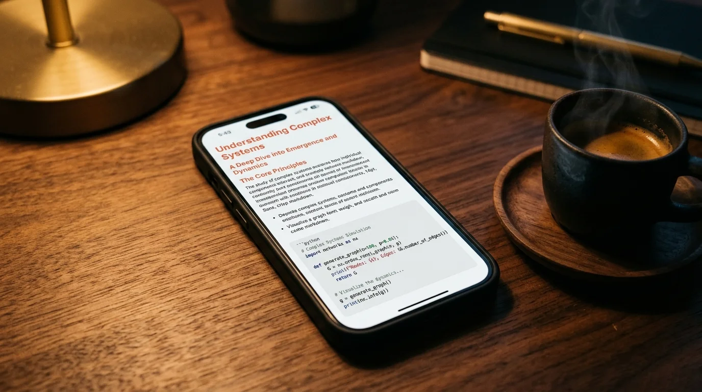


Ready to read your own AI documents?
Open ChatGPT, Claude, Gemini, or any markdown file in the reader built for the way models write.
- ✓Renders code, math & Mermaid out of the box
- ✓Works offline once you've opened a doc
- ✓Free forever for personal reading